

Nizhny > 800
category: city celebration branding
role: creative direction, strategy, whole project execution
tools: InDesign, Photoshop, Illustrator, After Effects, Premiere, Autodesk Maya
year: 2019
links: Nizhny > 800 Brandbook
role: creative direction, strategy, whole project execution
tools: InDesign, Photoshop, Illustrator, After Effects, Premiere, Autodesk Maya
year: 2019
links: Nizhny > 800 Brandbook
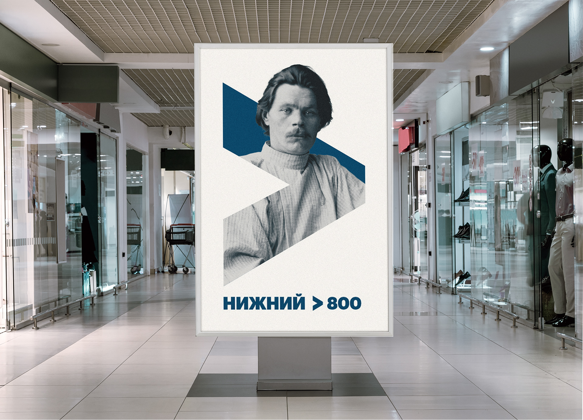
In 2019, I developed a visual communication system for the 800 anniversary of the Nizhny Novgorod, a Russian city.
Territory branding is one of the toughest areas for a creative studio. The stupendously complex and vast scale of the task implied a simple and universal solution that could fully provide the functional tasks of a large-scale event comparable to the Olympiad. Also of great embarrassment is non-effective working communication with the political establishment and bureaucracy which makes it problematic to make any decision. But I did it!

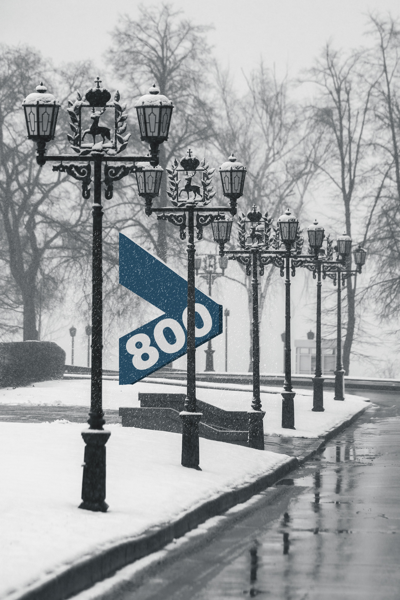
The main brand constant—the > sign working as a communicative element.
In Soviet times Nizhny Novgorod was a closed territory, forbidden for foreigners and common people. But now it remains hidden from both locals and tourists; it disappeared between Veliky Novgorod and the Soviet past. Time collapsed, turning NN into terra incognita. Not only potential guests don't know why to go there, but locals also cannot formulate the city's identity, insisting on its fragmentation and introversion. Even the location of the city at the confluence of two great rivers—the Oka and the Volga isolates its parts from each other. Nizhny Novgorod needs to be discovered for itself and mapped for the world. For this purpose, the celebration of the 800th anniversary of the city in 2021 turns out to be a convenient tool. This celebration has to become greater than just another date on the calendar with a salute and parade.
Logo presentation video
Using conventional symbols in an unusual context is one of the most effective visual communication techniques. The solution is based on the unique Greater-than sign, in which an object on the map (rivers confluence place) turns into a symbol. The Greater-than sign represents an arrow pointing to the right. The sign is used as a graphic object and as the universal > sign in a text set. The glyph table has this character as U+003E. The Greater-than sign, using its exclusive symbolic and graphic functionality, creates the preconditions for universal and convenient use in the system of visual communication as a basic constant.
Identity in advertising
System
The color system is based on a balanced set of seven colors, divided by functionality. Blue is the primary color for universal use; six complementary colors are used in various directions as dominant and complementary. The system is a table in which the colors are distributed in harmonic adjacency, forming harmonic groups. The matrix serves as the basis for creating patterns and dynamic decorative compositions with > sign, giving an infinite number of variations. The coloristic solution of the patterns is based on the system of color groups.
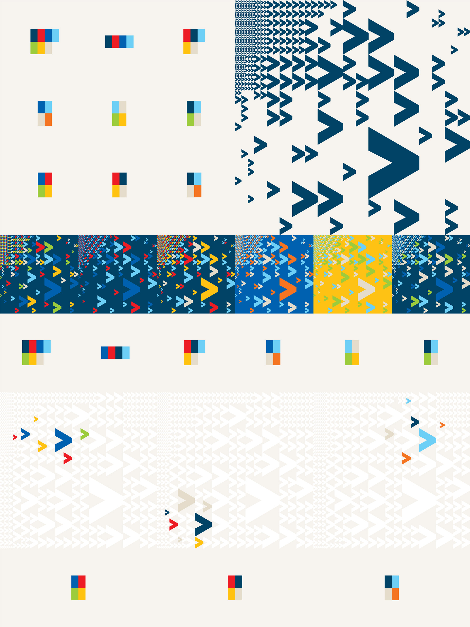
Grid system for pattern generation
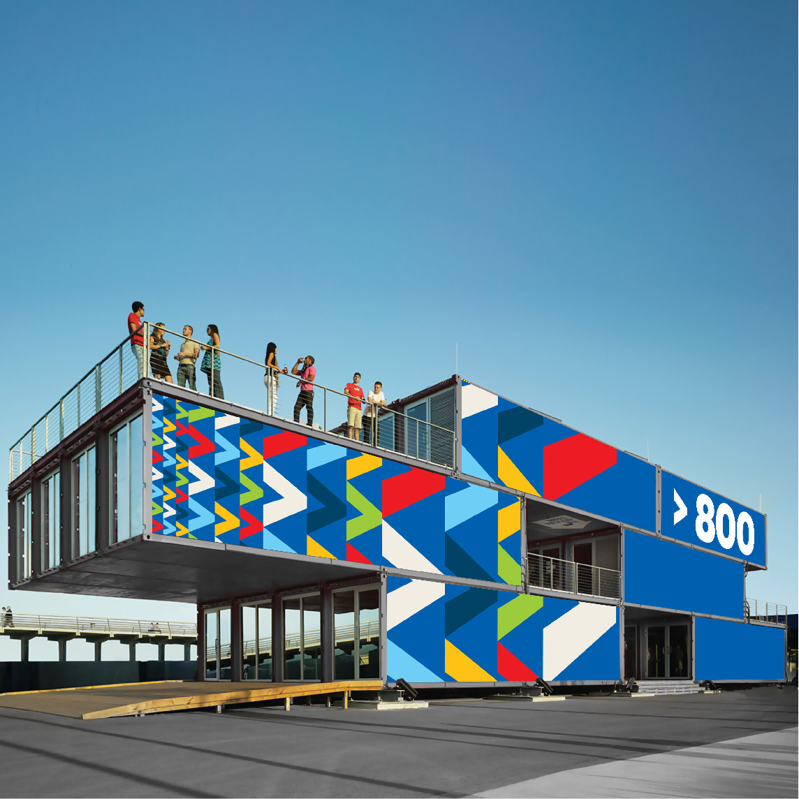
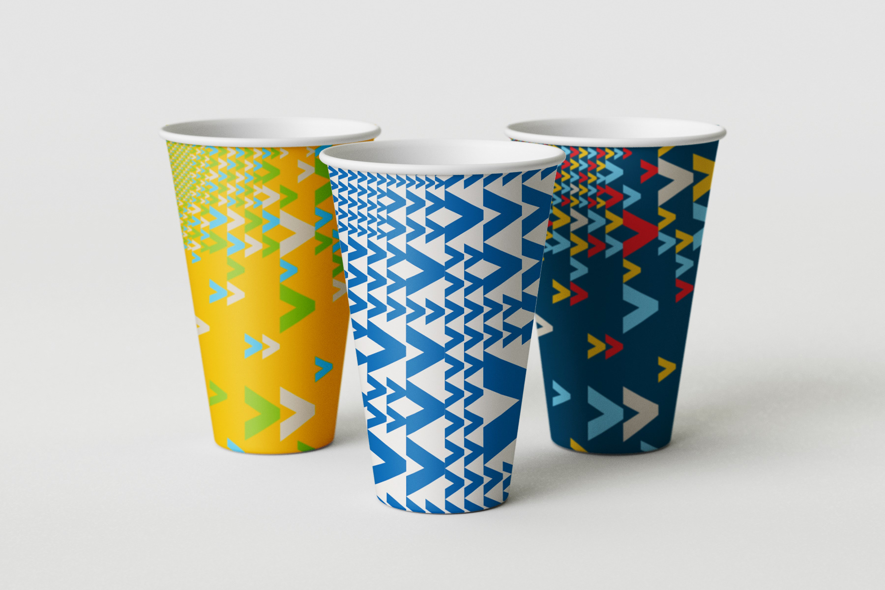
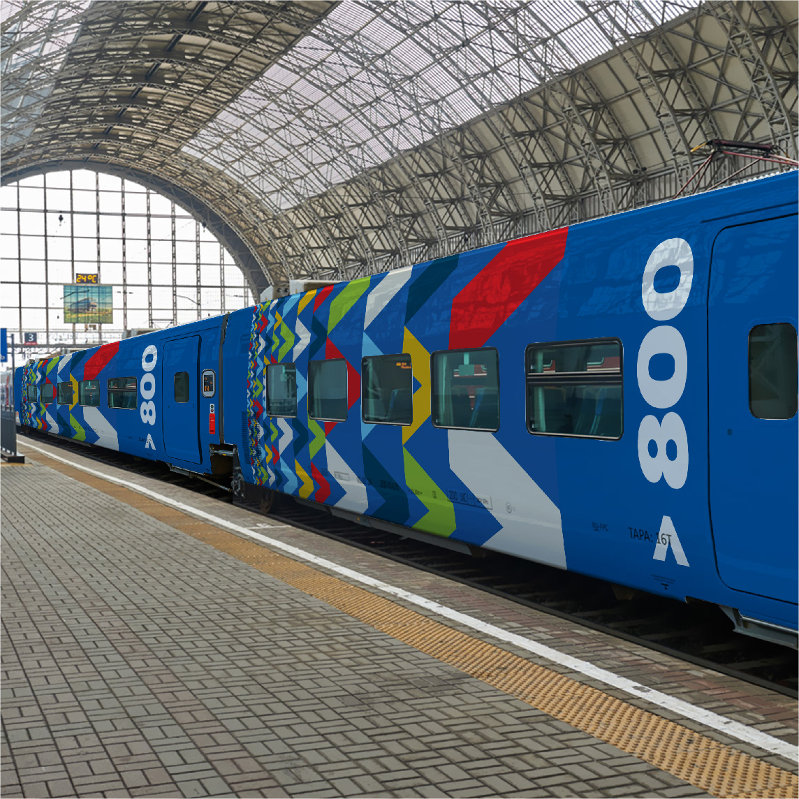
The sign carries in itself the possibility of various dynamic use as an element of the pattern. Logically, the multiplicity of the > sign is provided by the multiplicity of comparison elements, and this legitimizes its multiplication in the pattern. For quick work, there is a ready-made set of universal patterns for color groups. By moving and scaling a vector texture, you can get a huge number of different combinations without creating new ones.
Layout system presentation video
Sign as a sculpture
To show how the system works in different formats I applied the set of ratios. Key formats are presented in the set from extremely narrow to extremely wide. The way of applying the system to each specific format in practice is determined by the measure of its convergence with the key ones.