
Looch
category: youth photo festival
role: creative direction, name, concept, art direction, design
tools: InDesign, Photoshop, Illustrator
year: 2019
role: creative direction, name, concept, art direction, design
tools: InDesign, Photoshop, Illustrator
year: 2019
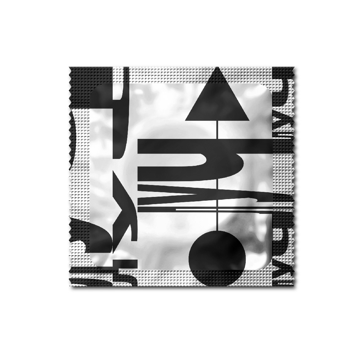
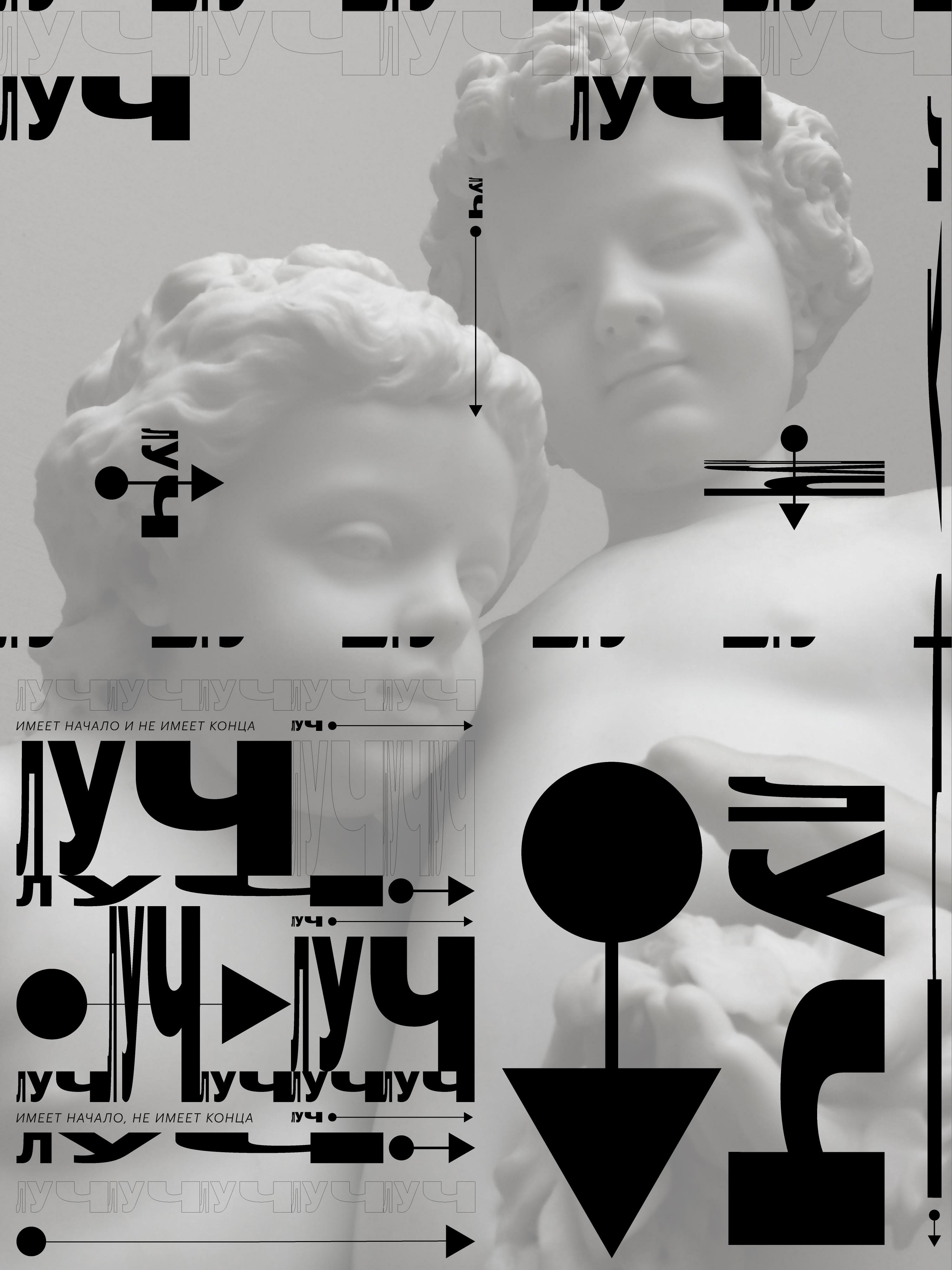
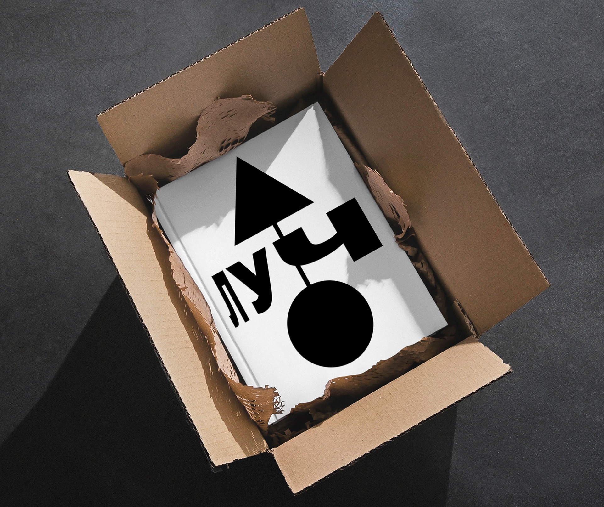
I started with the name: Looch (Луч) in Russian means, at the same time, the beam of light and a geometrical ray.
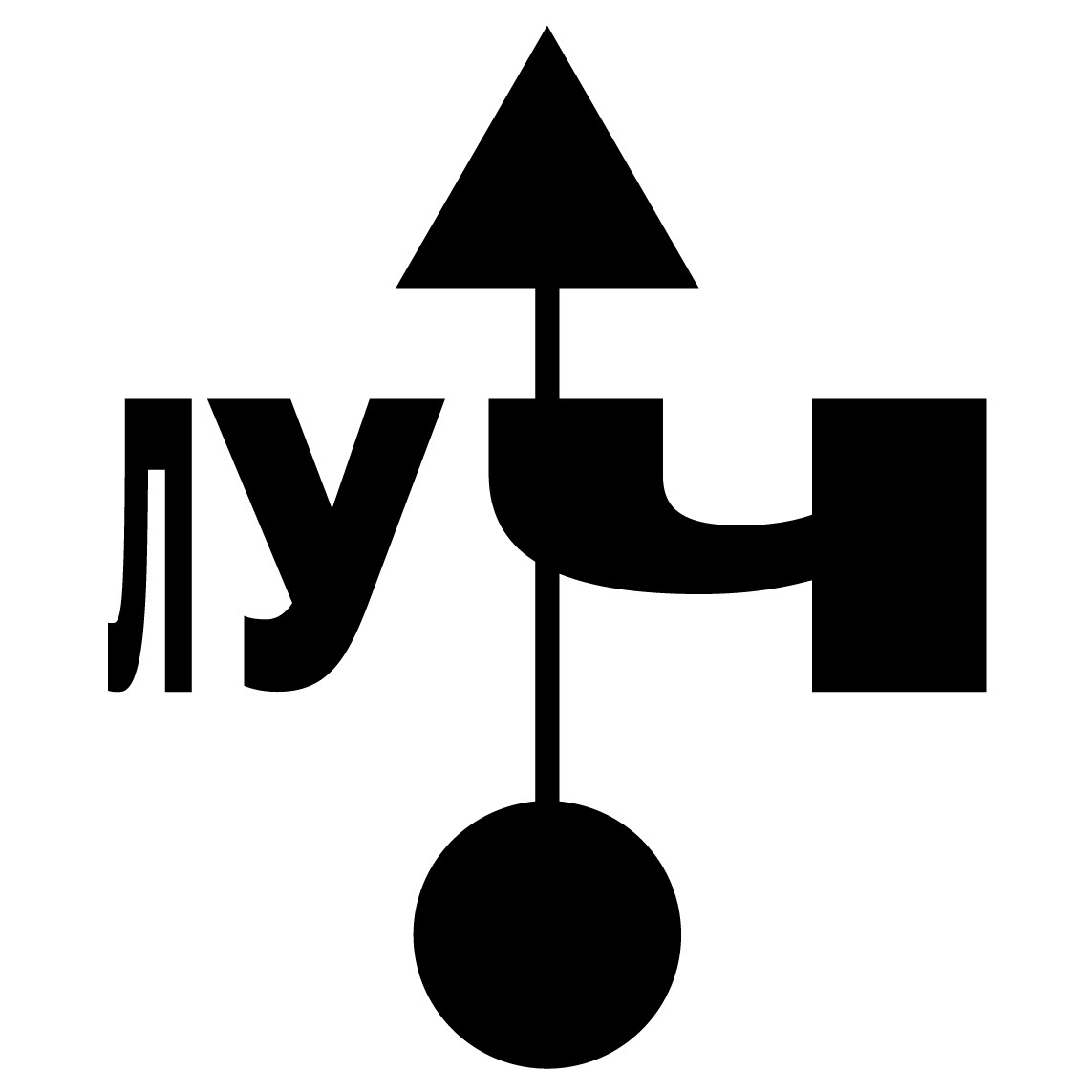
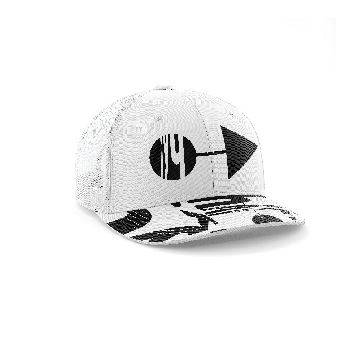
Logo
Thus, that metaphor reflects the physical process of photographing and the aspiration for the future inherent in young photographers. The Cyrillic graph Луч of the name looks super-duper and droll. I found it an excellent subject of typography and design.
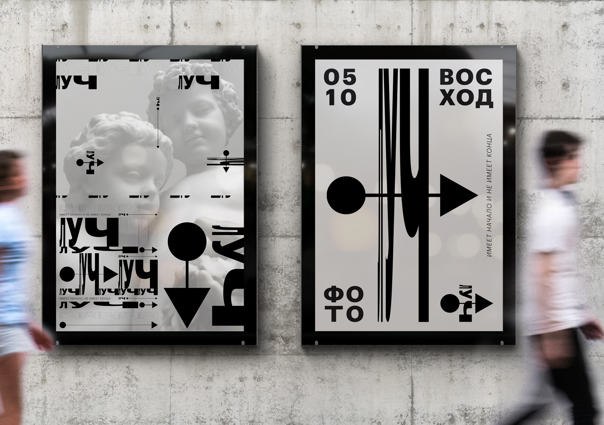
Posters
The ray is, first of all, energy: an energy impulse that has a starting point and follows to infinity. It has a beginning but no end. This energy impulse has an exact graphical expression in the form of a mathematical symbol.
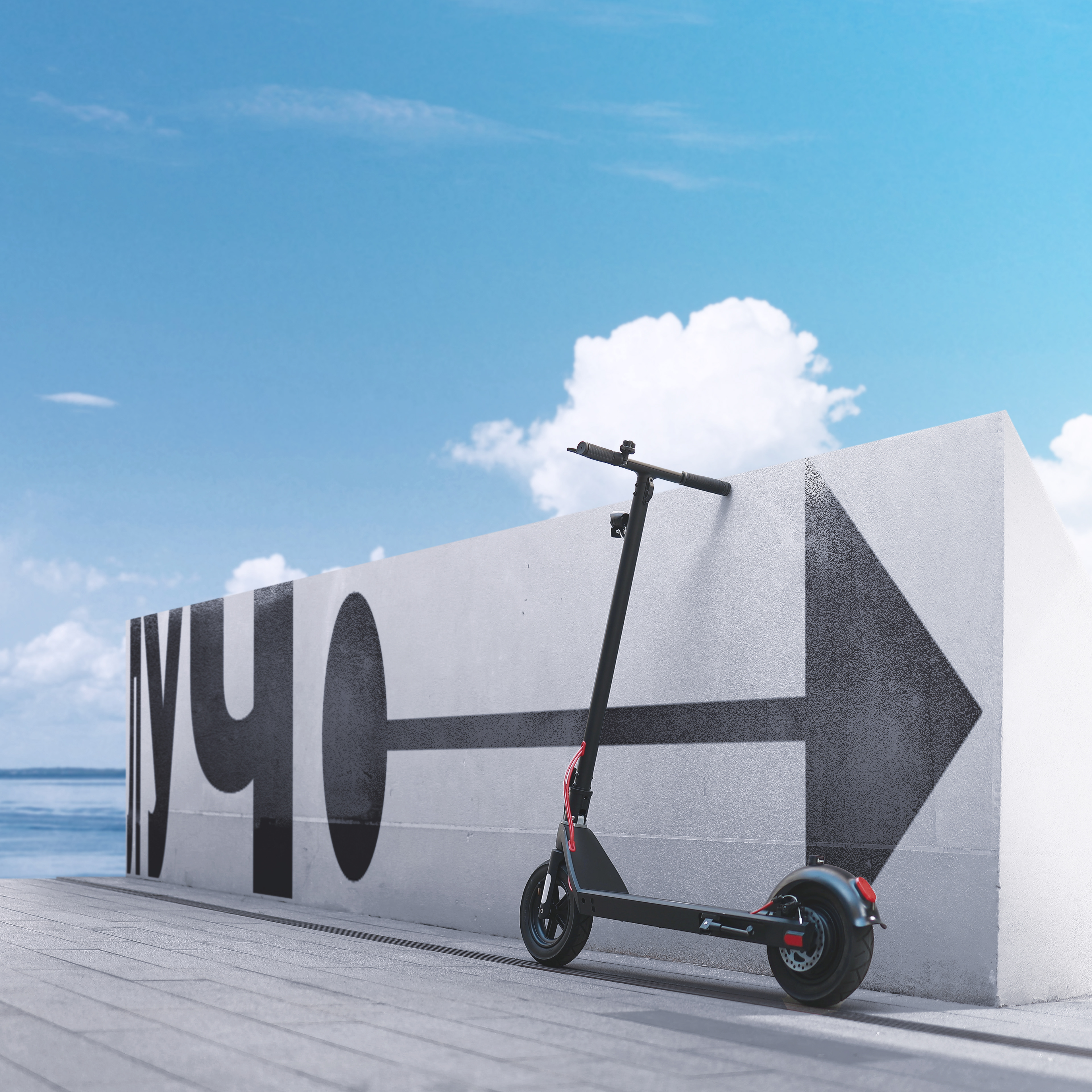
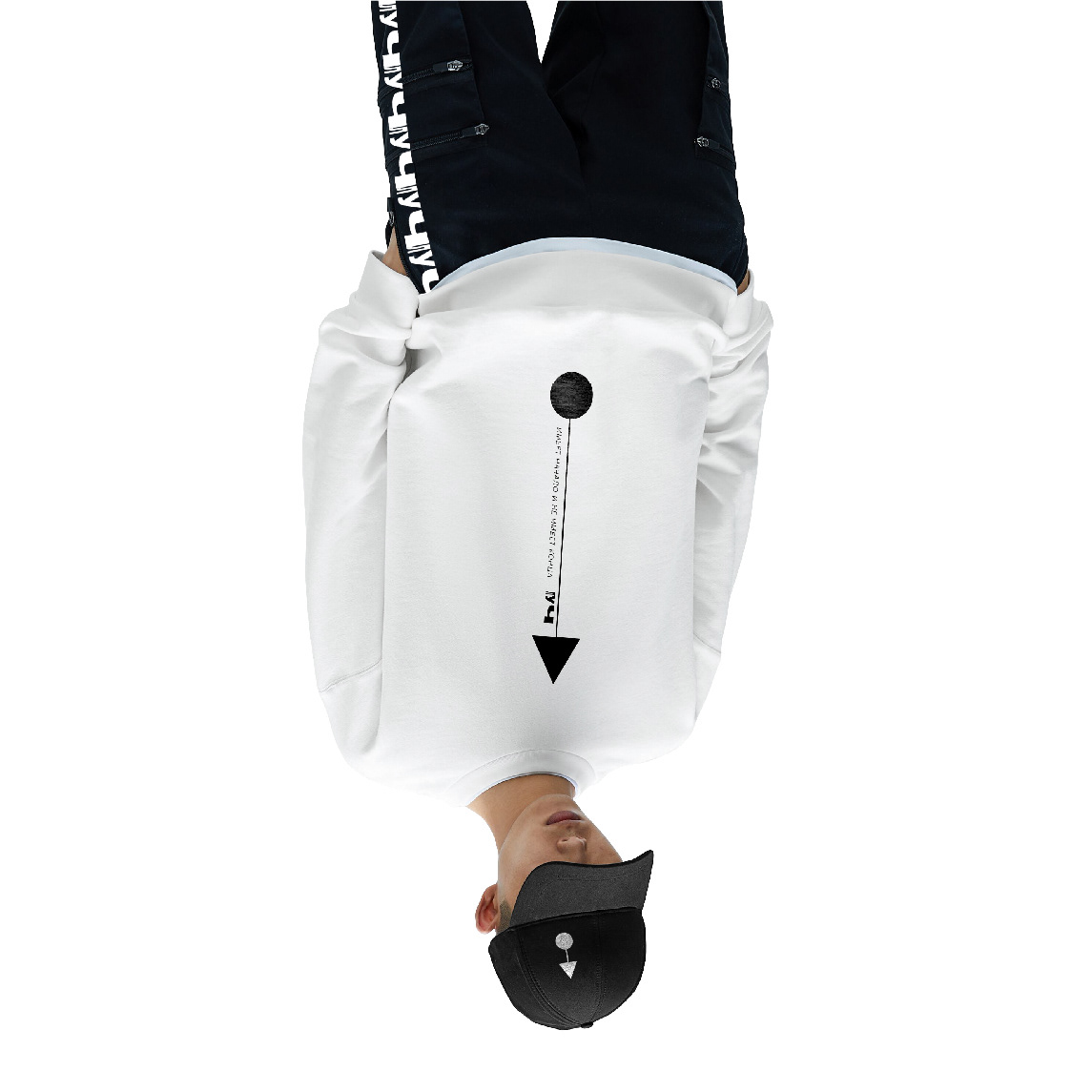
Style applications
The ray has no destination—it is essentially an endless forward movement. But it has a starting point, right here and right now. The ray symbol expresses this idea absolutely—it is a metaphor for the beginning and energy of the future in pure mathematical form.
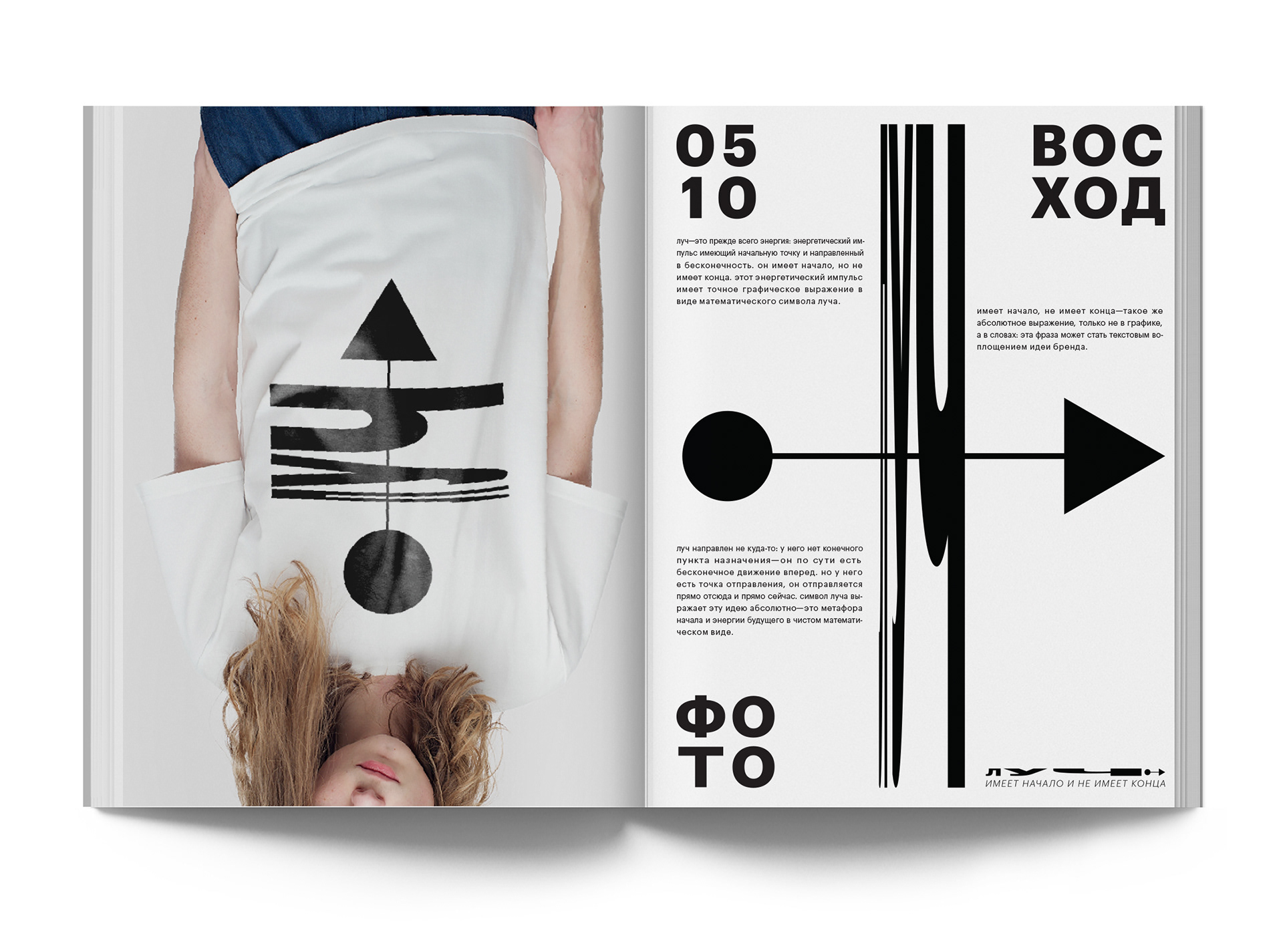
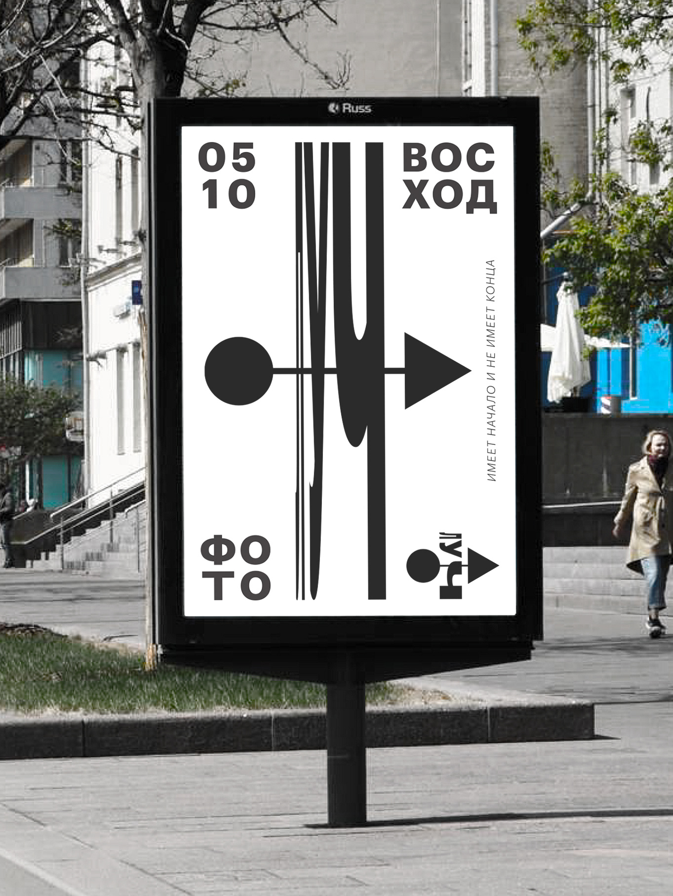
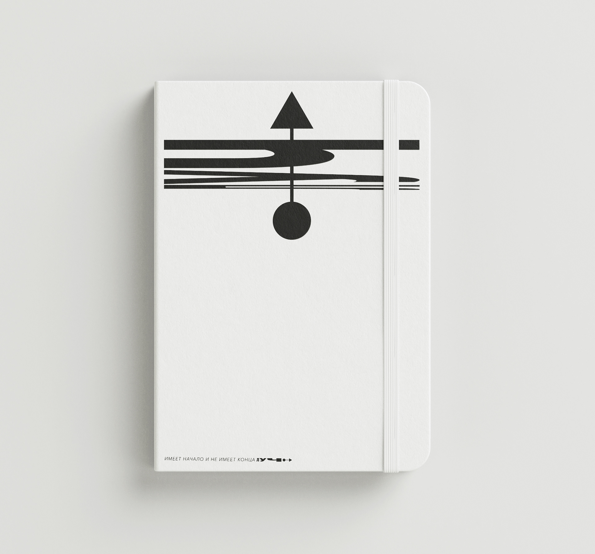

It has a beginning, it has no end—the same absolute expression, only not in graphics, but in words: this phrase has become a textual embodiment of the idea of visual communication of the youth photo festival in Sochi.